

Mert and Marcus
- 100742972
- Apr 14
- 2 min read
Mert and Marcus are a pair of fashion photographers, Mert Alaş and Marcus Piggott, who create their work together and came to fame in the 90's through their use of digital manipulation to create interesting colours that pop from the page. Their work is heavily influenced by Guy Bourdin, another fashion photographer who also altered his pieces digitally, saturating the colours and creating a surreal feel to each one.
Mert and Marcus' strange and unique aesthetic makes them popular among haute-couture magazines, where the advertisers often let them create their work without much instruction from the designers, instead they are left with the models, garments and equipment to take their photographs as they please. They created their aesthetic through shoots with magazines such as Dazed & Confused and i-D, later moving more prestigious brands such as Louis Vuitton and Vogue. They often take photographs for editorials where they are not paid, however, they still value this work highly as it gives them the most creative freedom to create artwork through the lens.
They have worked with many famous people over the years, photographing Cara Delevingne for The Love Magazine, and Taylor Swift for Vogue in 2016, both images with bright pops of red.
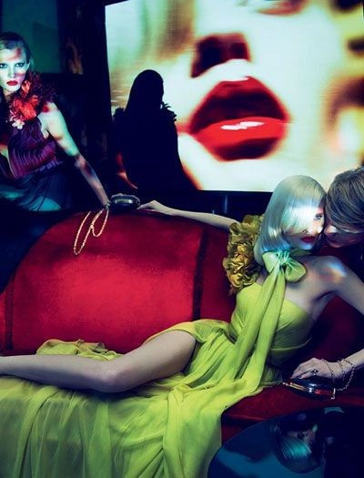
Over the years, Mert and Marcus have had many photography styles, starting out with acidic triads of colour and later moving to monochrome with a pop of colour here and there. I think the most interesting aesthetic they used was when they utilised clashing hyper saturated colours. Many of these pieces use triadic colours, blue, red and yellow to create a strange and quite unpleasant colour scheme to their work. Because of the placement of these colours on the colour wheel, they are all equally spaced in a triangle and these colours are not advised to be used together because of this and because they are all primary colours. These tones are then highly saturated to make them appear to glow acidically, often contrasting against a dark background. These bright colours help catch the eye of the viewer and even though the colours use do not peacefully exist together on the page, it had resulted in Mert and Marcus' distinct style of photography that has become recognisable as their own.
Many of their photographs have a romantic feel to them, often featuring women in long, flowing dresses by ponds or laying on Chaise Longues, however there is a dark twist to many through the use of colour or manipulation. A lot of their pieces remind me of Neo Noir photography because of the black and white but with bold highlights of colour, also the topic of Neo Noir is romantic but dark at the same time. Many of their shoots feature dark alleys or scantily dressed models by big black cars, while still romanticising the products, they are sometimes doing this in unconventional ways.


Comments